
Harrison, Richard Edes (sold)

Richard Edes Harrison (1902 - January 5, 1994) was an American cartographer and cartoonist active in the middle part of the 20th century. Harrison is credited with redefining cartography, especially journalistic cartography, by employing spherical perspective, bold shading, and graphic design to both make maps more publicly accessible and give them an artistic dimension. Harrison was born in Baltimore and studied design at Yale, graduating in 1923, before relocating to New York City at the height of the Great Depression. He made ends meet through industrial design work, creating everything from bottles to ashtrays. His first foray into the cartographic world was a fill-in job at Fortune magazine. The editors at Fortune must have admired his work for it launched a long-standing collaboration. His work, doubtless inspired by the age of air travel, became exceptionally popular during World War II, where his unique approach and political charged subject matter illustrated the seats of war with exceptional poignancy and clarity. After the war, Harrison continued to produce maps from his base in New York City. In his spare time he was an avid ornithologist and was commonly seen in Central Park in search of rare bird sightings.
HIghlights all of New York City's landmarks: the Empire State Building, the Chrysler Building, and Times Square.
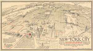
An Aeril View of New York City Showing How Easily the Weary Traveler May Reach the Herald Square Hotel Wherein He Will Find the Rest - Comfort - and Hospitality to Which He is Entitled, Even in this Day and Age.
sold
- Digital Map Information
- Suitable for large format printing
- File Size: 3.68 MB
- File Type: ZIP / TIFF
- ICC color profile embedded
- Delivered instantly via download link
This is a 1931 Richard Edes Harrison pictorial bird's eye view of New York City. Oriented towards the north, the map depicts the city from the Hudson River to Queens and from Westchester County to Thirtieth Street. Wonderfully illustrated with numerous buildings ... (more details)
An Early Masterpiece of Harrison's Cartographic Presentation of Data.
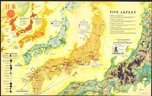
Five Japans.
sold
- Digital Map Information
- Suitable for large format printing
- File Size: 15.46 MB
- File Type: ZIP / TIFF
- ICC color profile embedded
- Delivered instantly via download link
This 1936 Richard Edes Harrison map of Japan - really, five separate maps of Japan on a single sheet – is one of the graphic artist Harrison's first published forays in cartography, and is a superb representation of his skill at the visual display of quantitative information. Accompanying an article describing Japan's pre-war industrial powerhouse, this combination of maps uses bright color in Harrison's inimitable style to clearly present a layered picture of Japan, her people, and her industries. The five maps fan out across the page in a visually arresting composition. (more details)
Robert Moses' Stamp on New York City.
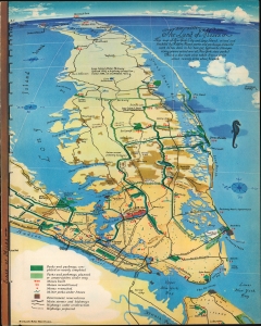
The Land of Moses. This map of New York City and Long Island.
sold
- Digital Map Information
- Suitable for large format printing
- File Size: 9.21 MB
- File Type: ZIP / TIFF
- ICC color profile embedded
- Delivered instantly via download link
This 1938 Richard Edes Harrison map of New York City and Long Island focuses on the monumental works of the legendary and tempestuous Commissioner of Parks for New York City, Robert Moses. (more details)
Robert Moses' Stamp on New York City.
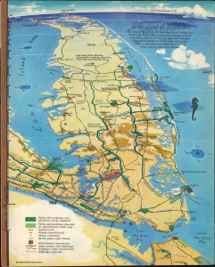
The Land of Moses. This map of New York City and Long Island.
sold
- Digital Map Information
- Suitable for large format printing
- File Size: 9.04 MB
- File Type: ZIP / TIFF
- ICC color profile embedded
- Delivered instantly via download link
This 1938 Richard Edes Harrison map of New York City and Long Island focuses on the monumental works of the legendary and tempestuous Commissioner of Parks for New York City, Robert Moses. (more details)
Abundantly Data-Rich Midcentury Map of New York City
The City of New York.
sold
- Digital Map Information
- Suitable for large format printing
- File Size: 46.36 MB
- File Type: ZIP / TIFF
- ICC color profile embedded
- Delivered instantly via download link
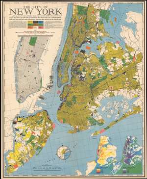
This 1939 Richard Edes Harrison map of New York City - published in conjunction with the New York World’s Fair – represents a triumph of the visual display of quantitative information. Its aesthetic impact is all the more impressive in its clear expression of municipal and demographic data, making this a map of the people of New York City, as much as of the physical city itself. All five boroughs are represented in the primary map. On it, Harrison’s masterful use of vivid color to distinguish between residential, commercial, industrial, and federal use of land is clear yet supple, able to make distinction (for example) of low-income housing projects using the same palette. Parks and cemeteries both appear as green spaces, with white spots - evoking headstones - indicating the difference between the two. The two major airports (Floyd Bennett Field and North Beach Airport) are given their own color as well. The city’s industrial areas, shown in black, dominate the East River and Hudson coastlines, a reminder of the centrality of trade to the city’s development and history. (more details)
Abundantly Data-Rich Midcentury Map of New York City
The City of New York.
sold
- Digital Map Information
- Suitable for large format printing
- File Size: 50.69 MB
- File Type: ZIP / TIFF
- ICC color profile embedded
- Delivered instantly via download link
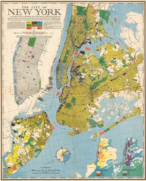
This 1939 Richard Edes Harrison map of New York City - published in conjunction with the New York World’s Fair – represents a triumph of the visual display of quantitative information. Its aesthetic impact is all the more impressive in its clear expression of municipal and demographic data, making this a map of the people of New York City, as much as of the physical city itself. All five boroughs are represented in the primary map. On it, Harrison’s masterful use of vivid color to distinguish between residential, commercial, industrial, and federal use of land is clear yet supple, able to make distinction (for example) of low-income housing projects using the same palette. Parks and cemeteries both appear as green spaces, with white spots - evoking headstones - indicating the difference between the two. The two major airports (Floyd Bennett Field and North Beach Airport) are given their own color as well. The city’s industrial areas, shown in black, dominate the East River and Hudson coastlines, a reminder of the centrality of trade to the city’s development and history. (more details)
Brilliant, data rich depiction of mid-century New York.
The City of New York.
sold
- Digital Map Information
- Suitable for large format printing
- File Size: 118.5 MB
- File Type: ZIP / TIFF
- ICC color profile embedded
- Delivered instantly via download link
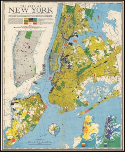
This 1939 Richard Edes Harrison map of New York City - published in conjunction with the New York World’s Fair – represents a triumph of the visual display of quantitative information. Its aesthetic impact is all the more impressive in its clear expression of municipal and demographic data, making this a map of the people of New York City, as much as of the physical city itself. All five boroughs are represented in the primary map. On it, Harrison’s masterful use of vivid color to distinguish between residential, commercial, industrial, and federal use of land is clear yet supple, able to make distinction (for example) of low-income housing projects using the same palette. Parks and cemeteries both appear as green spaces, with white spots - evoking headstones - indicating the difference between the two. The two major airports (Floyd Bennett Field and North Beach Airport) are given their own color as well. The city’s industrial areas, shown in black, dominate the East River and Hudson coastlines, a reminder of the centrality of trade to the city’s development and history. (more details)
Abundantly Data-Rich Midcentury Map of New York City
The City of New York.
sold
- Digital Map Information
- Suitable for large format printing
- File Size: 45.02 MB
- File Type: ZIP / TIFF
- ICC color profile embedded
- Delivered instantly via download link
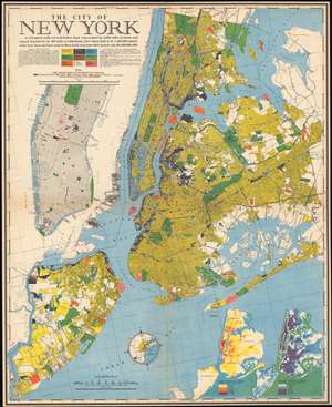
This 1939 Richard Edes Harrison map of New York City - published in conjunction with the New York World’s Fair – represents a triumph of the visual display of quantitative information. Its aesthetic impact is all the more impressive in its clear expression of municipal and demographic data, making this a map of the people of New York City, as much as of the physical city itself. All five boroughs are represented in the primary map. On it, Harrison’s masterful use of vivid color to distinguish between residential, commercial, industrial, and federal use of land is clear yet supple, able to make distinction (for example) of low-income housing projects using the same palette. Parks and cemeteries both appear as green spaces, with white spots - evoking headstones - indicating the difference between the two. The two major airports (Floyd Bennett Field and North Beach Airport) are given their own color as well. The city’s industrial areas, shown in black, dominate the East River and Hudson coastlines, a reminder of the centrality of trade to the city’s development and history. (more details)
Abundantly Data-Rich Midcentury Map of New York City
The City of New York.
sold
- Digital Map Information
- Suitable for large format printing
- File Size: 46.66 MB
- File Type: ZIP / TIFF
- ICC color profile embedded
- Delivered instantly via download link
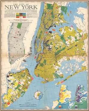
This 1939 Richard Edes Harrison map of New York City - published in conjunction with the New York World’s Fair – represents a triumph of the visual display of quantitative information. Its aesthetic impact is all the more impressive in its clear expression of municipal and demographic data, making this a map of the people of New York City, as much as of the physical city itself. All five boroughs are represented in the primary map. On it, Harrison’s masterful use of vivid color to distinguish between residential, commercial, industrial, and federal use of land is clear yet supple, able to make distinction (for example) of low-income housing projects using the same palette. Parks and cemeteries both appear as green spaces, with white spots - evoking headstones - indicating the difference between the two. The two major airports (Floyd Bennett Field and North Beach Airport) are given their own color as well. The city’s industrial areas, shown in black, dominate the East River and Hudson coastlines, a reminder of the centrality of trade to the city’s development and history. (more details)
Abundantly Data-Rich Midcentury Map of New York City.
The City of New York.
sold
- Digital Map Information
- Suitable for large format printing
- File Size: 78.57 MB
- File Type: ZIP / TIFF
- ICC color profile embedded
- Delivered instantly via download link
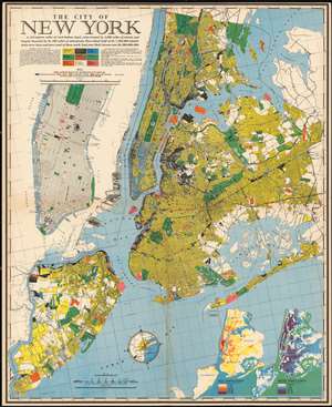
This 1939 Richard Edes Harrison map of New York City - published in conjunction with the New York World’s Fair – represents a triumph of the visual display of quantitative information. Its aesthetic impact is all the more impressive in its clear expression of municipal and demographic data, making this a map of the people of New York City, as much as of the physical city itself. All five boroughs are represented in the primary map. On it, Harrison’s masterful use of vivid color to distinguish between residential, commercial, industrial, and federal use of land is clear yet supple, able to make distinction (for example) of low-income housing projects using the same palette. Parks and cemeteries both appear as green spaces, with white spots - evoking headstones - indicating the difference between the two. The two major airports (Floyd Bennett Field and North Beach Airport) are given their own color as well. The city’s industrial areas, shown in black, dominate the East River and Hudson coastlines, a reminder of the centrality of trade to the city’s development and history. (more details)
A brilliant, data rich depiction of early mid-century New York City.
The City of New York.
sold
- Digital Map Information
- Suitable for large format printing
- File Size: 78.19 MB
- File Type: ZIP / TIFF
- ICC color profile embedded
- Delivered instantly via download link
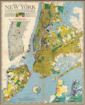
This 1939 Richard Edes Harrison map of New York City - published in conjunction with the New York World’s Fair – represents a triumph of the visual display of quantitative information. Its aesthetic impact is all the more impressive in its clear expression of municipal and demographic data, making this a map of the people of New York City, as much as of the physical city itself. All five boroughs are represented in the primary map. On it, Harrison’s masterful use of vivid color to distinguish between residential, commercial, industrial, and federal use of land is clear yet supple, able to make distinction (for example) of low-income housing projects using the same palette. Parks and cemeteries both appear as green spaces, with white spots - evoking headstones - indicating the difference between the two. The two major airports (Floyd Bennett Field and North Beach Airport) are given their own color as well. The city’s industrial areas, shown in black, dominate the East River and Hudson coastlines, a reminder of the centrality of trade to the city’s development and history. (more details)
A brilliant, data rich depiction of early mid-century New York City.
The City of New York.
sold
- Digital Map Information
- Suitable for large format printing
- File Size: 47.57 MB
- File Type: ZIP / TIFF
- ICC color profile embedded
- Delivered instantly via download link
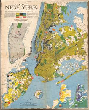
This 1939 Richard Edes Harrison map of New York City - published in conjunction with the New York World’s Fair - represents a triumph of the visual display of quantitative information. Its aesthetic impact is all the more impressive in its clear expression of municipal and demographic data, making this a map of the people of New York City, as much as of the physical city itself. All five boroughs are represented in the primary map. On it, Harrison’s masterful use of vivid color to distinguish between residential, commercial, industrial, and federal use of land is clear yet supple, able to make distinction (for example) of low-income housing projects using the same palette. Parks and cemeteries both appear as green spaces, with white spots - evoking headstones - indicating the difference between the two. The two major airports (Floyd Bennett Field and North Beach Airport) are given their own color as well. The city’s industrial areas, shown in black, dominate the East River and Hudson coastlines, a reminder of the centrality of trade to the city’s development and history. (more details)
Brilliant, data rich depiction of early mid-century New York City.
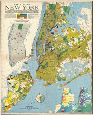
The City of New York.
sold
- Digital Map Information
- Suitable for large format printing
- File Size: 53.01 MB
- File Type: ZIP / TIFF
- ICC color profile embedded
- Delivered instantly via download link
This 1939 Richard Edes Harrison map of New York City - published in conjunction with the New York World’s Fair – represents a triumph of the visual display of quantitative information. Its aesthetic impact is all the more impressive in its clear expression of municipal and demographic data, making this a map of the people of New York City, as much as of the physical city itself. All five boroughs are represented in the primary map. On it, Harrison’s masterful use of vivid color to distinguish between residential, commercial, industrial, and federal use of land is clear yet supple, able to make distinction (for example) of low-income housing projects using the same palette. Parks and cemeteries both appear as green spaces, with white spots - evoking headstones - indicating the difference between the two. The two major airports (Floyd Bennett Field and North Beach Airport) are given their own color as well. The city’s industrial areas, shown in black, dominate the East River and Hudson coastlines, a reminder of the centrality of trade to the city’s development and history. (more details)
Brilliant, data rich depiction of mid-century New York.
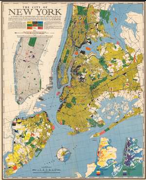
The City of New York.
sold
- Digital Map Information
- Suitable for large format printing
- File Size: 77.21 MB
- File Type: ZIP / TIFF
- ICC color profile embedded
- Delivered instantly via download link
This 1939 Richard Edes Harrison map of New York City - published in conjunction with the New York World’s Fair – represents a triumph of the visual display of quantitative information. Its aesthetic impact is all the more impressive in its clear expression of municipal and demographic data, making this a map of the people of New York City, as much as of the physical city itself. All five boroughs are represented in the primary map. On it, Harrison’s masterful use of vivid color to distinguish between residential, commercial, industrial, and federal use of land is clear yet supple, able to make distinction (for example) of low-income housing projects using the same palette. Parks and cemeteries both appear as green spaces, with white spots - evoking headstones - indicating the difference between the two. The two major airports (Floyd Bennett Field and North Beach Airport) are given their own color as well. The city’s industrial areas, shown in black, dominate the East River and Hudson coastlines, a reminder of the centrality of trade to the city’s development and history. (more details)
Brilliant, data rich depiction of mid-century New York.
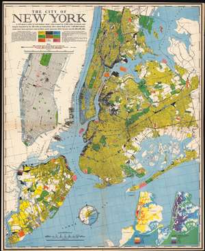
The City of New York.
sold
- Digital Map Information
- Suitable for large format printing
- File Size: 141.99 MB
- File Type: ZIP / TIFF
- ICC color profile embedded
- Delivered instantly via download link
This 1939 Richard Edes Harrison map of New York City - published in conjunction with the New York World’s Fair – represents a triumph of the visual display of quantitative information. Its aesthetic impact is all the more impressive in its clear expression of municipal and demographic data, making this a map of the people of New York City, as much as of the physical city itself. All five boroughs are represented in the primary map. On it, Harrison’s masterful use of vivid color to distinguish between residential, commercial, industrial, and federal use of land is clear yet supple, able to make distinction (for example) of low-income housing projects using the same palette. Parks and cemeteries both appear as green spaces, with white spots - evoking headstones - indicating the difference between the two. The two major airports (Floyd Bennett Field and North Beach Airport) are given their own color as well. The city’s industrial areas, shown in black, dominate the East River and Hudson coastlines, a reminder of the centrality of trade to the city’s development and history. (more details)
Brilliant, data rich depiction of mid-century New York.
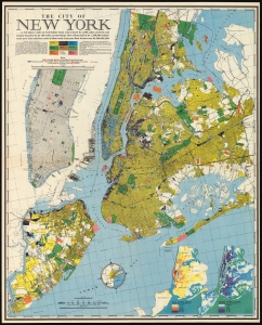
The City of New York.
sold
- Digital Map Information
- Suitable for large format printing
- File Size: 128.5 MB
- File Type: ZIP / TIFF
- ICC color profile embedded
- Delivered instantly via download link
This 1939 Richard Edes Harrison map of New York City - published in conjunction with the New York World’s Fair - represents a triumph of the visual display of quantitative information. Its aesthetic impact is all the more impressive in its clear expression of municipal and demographic data, making this a map of the people of New York City, as much as of the physical city itself. All five boroughs are represented in the primary map. On it, Harrison’s masterful use of vivid color to distinguish between residential, commercial, industrial, and federal use of land is clear yet supple, able to make distinction (for example) of low-income housing projects using the same palette. Parks and cemeteries both appear as green spaces, with white spots - evoking headstones - indicating the difference between the two. The two major airports (Floyd Bennett Field and North Beach Airport) are given their own color as well. The city’s industrial areas, shown in black, dominate the East River and Hudson coastlines, a reminder of the centrality of trade to the city’s development and history. (more details)
Brilliant, data rich depiction of mid-century New York.
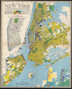
The City of New York.
sold
- Digital Map Information
- Suitable for large format printing
- File Size: 51.01 MB
- File Type: ZIP / TIFF
- ICC color profile embedded
- Delivered instantly via download link
This 1939 Richard Edes Harrison map of New York City - published in conjunction with the New York World’s Fair - represents a triumph of the visual display of quantitative information. Its aesthetic impact is all the more impressive in its clear expression of municipal and demographic data, making this a map of the people of New York City, as much as of the physical city itself. All five boroughs are represented in the primary map. On it, Harrison’s masterful use of vivid color to distinguish between residential, commercial, industrial, and federal use of land is clear yet supple, able to make distinction (for example) of low-income housing projects using the same palette. Parks and cemeteries both appear as green spaces, with white spots - evoking headstones - indicating the difference between the two. The two major airports (Floyd Bennett Field and North Beach Airport) are given their own color as well. The city’s industrial areas, shown in black, dominate the East River and Hudson coastlines, a reminder of the centrality of trade to the city’s development and history. (more details)
Brilliant, data rich depiction of mid-century New York.
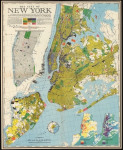
The City of New York.
sold
- Digital Map Information
- Suitable for large format printing
- Full resolution TIFF file
- ICC color profile embedded
- Delivered instantly via download link
This is an inscribed example of Richard Edes Harrison's 1939 map of New York City. Published in conjunction with the New York World’s Fair, his work represents a triumph of the visual display of quantitative information. Its aesthetic impact is all the more impressive in its clear expression of municipal and demographic data, making this a map of the people of New York City, as much as of the physical city itself. All five boroughs are represented in the primary map. On it, Harrison’s masterful use of vivid color to distinguish between residential, commercial, industrial, and federal use of land is clear yet supple, able to make distinction (for example) of low-income housing projects using the same palette. Parks and cemeteries both appear as green spaces, with white spots - evoking headstones - indicating the difference between the two. The two major airports (Floyd Bennett Field and North Beach Airport) are given their own color as well. The city’s industrial areas, shown in black, dominate the East River and Hudson coastlines, a reminder of the city’s past as a factory and shipping center. (more details)
Selling oil to both sides of the Second World War.
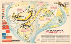
The World According to Standard (N.J.)
sold
- Digital Map Information
- Suitable for large format printing
- File Size: 14.78 MB
- File Type: ZIP / TIFF
- ICC color profile embedded
- Delivered instantly via download link
This is a May 1940 Richard Edes Harrison map of the world, illustrating the international operations of Standard Oil and its partners in the opening year of the Second World War and the oil corporation's continuance of trade with all combatants. (more details)
Engaging Harrison orthographic projection FORTUNE Magazine map printed during World War II.
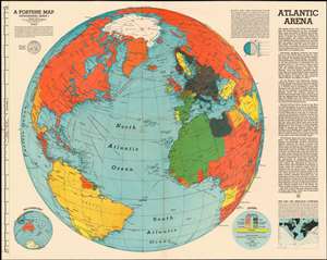
Atlantic Arena. A Fortune Map. Orthographic Series I.
sold
- Digital Map Information
- Suitable for large format printing
- File Size: 38.43 MB
- File Type: ZIP / TIFF
- ICC color profile embedded
- Delivered instantly via download link
This is a June 1942 Richard Edes Harrison orthographic map of the Atlantic theatre of World War II, intended to reinforce American support for actively prosecuting the war in Europe. Centered on the North Atlantic, the map shows all of North America and the Atlantic coastlines of South America, Africa, and Europe. The map's intent is to emphasize the growing importance of the Atlantic theatre to an American public whose attention had been held by the Pacific theatre of the war. A key entitled 'The Line-Up on May 10, 1942' indicates how color is used on the map to identify the affiliation the nations shown. Red for the Allies and black for the Axis, gradations of those colors to indicate occupied countries, gold for pro-Ally nations and green for pro-Axis. Yellow indicates neutral nations. While the sporting reference of 'The Line-Up' might be glib, the strong implication is not only that sides exist in the conflict, but that they are unavoidable: 'true neutral' nations are vastly outnumbered by active players in what can easily be seen is a World War. The depicted sea routes, with the distances between key cities serve to emphasize the immediacy of the European conflict for Americans. Despite the apparently great Atlantic distances, routes between New York and Europe are dwarfed by the vast expanses of ocean lying between the North American west coast and Japan. The immediacy of the European theatre is being emphasized here. These were important points to drive home: while America's war throughout 1942 had been primarily fought in the Pacific, change was in the air. In the Atlantic, the German U-Boat war was going through a disturbing period of success. Britain was fighting Germany and Italy in North Africa. But at the same time, the first American forces were finding their way east: Air Corps bases had by May been established in the UK, and the first U.S. ground forces (including the 1st Armored Division) had been committed to Ireland. While the United States had been galvanized for war against Japan following Pearl Harbor, public support for a European war was less sanguine. (more details)
A new perspective on the Pacific Theater.
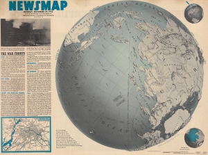
NEWSMAP. Monday, November 29, 1943. Week of November 18 to November 25. 220th Week of the War - 102nd Week of U.S. Participation.
sold
- Digital Map Information
- Suitable for large format printing
- Full resolution TIFF file
- ICC color profile embedded
- Delivered instantly via download link
Attempting to help viewers gain a new perspective on distances involved in fighting the Pacific front, this is a 1943 Army Orientation Branch Newsmap map of the Pacific Ocean and Asia. Using a map created by Richard Edes Harrison, this Newsmap places Japan at the center of a globe. (more details)
Engaging Harrison orthographic projection FORTUNE Magazine map printed during World War II.
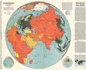
World Island. A Fortune Map. Orthographic Series, III.
sold
- Digital Map Information
- Suitable for large format printing
- File Size: 14.98 MB
- File Type: ZIP / TIFF
- ICC color profile embedded
- Delivered instantly via download link
This is a 1943 Richard Edes Harrison and Fortune Magazine orthographic map of the Eastern Hemisphere, including Asia, Africa, and Europe, which they refer to as the 'World Island'. The map depicts the continents of Asia, Africa, and Europe as well as Indonesia, ... (more details)
An iconic American World War II propaganda broadside map by revolutionary cartography Richard Edes Harrison.
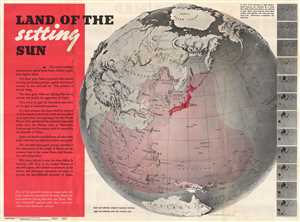
Land of the Setting Sun; Newsmap, Monday December 27, 1943.
sold
- Digital Map Information
- Suitable for large format printing
- File Size: 81.19 MB
- File Type: ZIP / TIFF
- ICC color profile embedded
- Delivered instantly via download link
An iconic American World War II propaganda broadside map by the cartographic innovator Richard Edes Harrison illustrating, as projected on the hemisphere, the expansion of the Japanese Empire. The broadside, Land of the Setting Sun , formally entitled Newsmap. ... (more details)
An amazing example of Harrison's innovative spherical perspective.
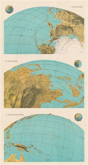
I: From Alaska. III: From Burma. II: From the Solomons.
sold
- Digital Map Information
- Suitable for large format printing
- File Size: 62.02 MB
- File Type: ZIP / TIFF
- ICC color profile embedded
- Delivered instantly via download link
This 1943 Richard Edes Harrison map of the Pacific exemplifies his innovative spherical projection - successfully employed in countless WWII maps. Harrison uses the Pacific Ocean, an important World War II theater, to present his new cartographic paradigm. Here, Harisson exaggerates vertical topography to stand out prominently on land spherically projected to imitate a relief globe. The result leads the reader to interpret the often localized events on which he is focusing, from a global perspective. Today Google Earth and other mapping apps adopt a similar approach. Harrison's audience in 1943, obsessed with every detail about the global war, responded enthusiastically to his approach. (more details)
An amazing example of Harrison's innovative spherical perspective.
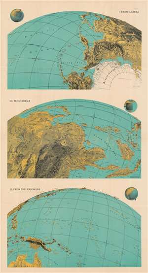
I: From Alaska. III: From Burma. II: From the Solomons.
sold
- Digital Map Information
- Suitable for large format printing
- File Size: 199.19 MB
- File Type: ZIP / TIFF
- ICC color profile embedded
- Delivered instantly via download link
This 1943 Richard Edes Harrison map of the Pacific exemplifies his innovative spherical projection, which he employed to good effect in his maps produced leading up to and during the Second World War. Many of Harrison's wartime readers responded enthusiastically to his approach - although isolationist critics complained that his decision to abandon more familiar projections was a polemical choice intended to emphasize the proximity of various theatres of war to American interests - particularly in the maps he produced prior to America's entry into the war. This was less the case with this triple map, printed well into the conflict and focusing on the likely approaches to Japan that might be exploited by the United States. (more details)
Two-sided U.S. Army publication detailing the the action of the first week of May 1944 - created for military use, not for public consumption!
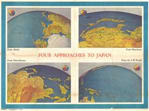
NEWSMAP. For the Armed Forces. 243rd Week of the War - 125th Week of U.S. Participation. Volume III No. 3F / Four Approaches to Japan. Volume III No. 3B
sold
- Digital Map Information
- Suitable for large format printing
- File Size: 49.06 MB
- File Type: ZIP / TIFF
- ICC color profile embedded
- Delivered instantly via download link
This is a 1944 Army Information Branch double-sided Newsmap for the week of April 27 to May 4, 1944. It was issued in May 8, 1944. One side of the map features four Richard Edes Harrison maps or views depicting the four approaches to Japan. The other includes ... (more details)
The last days of WWII - only Japan remains.
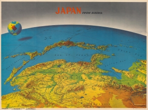
Japan from Siberia. / Newsmap Overseas Edition. For the Armed Forces. 295th Week of the War 177th Week of U.S. participation. Monday, 14 May, 1945. Week of 24 April to 1 May. Volume IV No. 3F.
sold
- Digital Map Information
- Suitable for large format printing
- Full resolution TIFF file
- ICC color profile embedded
- Delivered instantly via download link
This is a 1945 Army Orientation Branch Newsmap map of Japan in the scarce Overseas Edition. Published on Monday, May 14, 1945, this piece was distributed after Germany surrendered and the war in Europe had ended. The Army Orientation Branch utilizes the work of celebrated cartographer Richard Edes Harrison to highlight Japan, the only remaining Axis power, on the recto. On the verso, the historic linkup between the American Army and the Soviet Red Army is celebrated. (more details)